Our fourth-annual deep dive as Jeffrey P. Nesker and Mark Hinkley break down and grade every kit in MLS this season.
There’s only one way to open this year’s fourth (?!) annual WTR MLS Kit Round-up, and that’s with a banger …
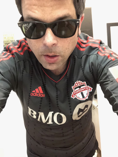
Onyx stans, rejoice? For it is upon us, the return of that shade that makes us all swoon, the colourway of THAT past TFC kit, that is everyone BUT Justin Morrow’s favourite. Yes, it’s true, we have a proper sequel to the 2014/2015 TFC away stripe.
JPN
As always, I’m joined by the illustrious Mark Hinkley, who is, in fact, extra illustrious this time around. In case you’ve been hiding under several rocks, this is the same mark Hinkley that had a hand designing the new TFC kit. So, yes, Sports Fans, expect some scoops to go with the hot takes this year. (And be sure to tune in for our extra long winded podcast/livecast component, hitting your eye and ear holes very soon!)
As we discovered last year, it’s better to split this into two nuggets and go alphabetical, so let’s do that. As always, we’ll each contribute a blurb and a rating.
This is Part 2 – N-V
Join us, we promise not to bite!
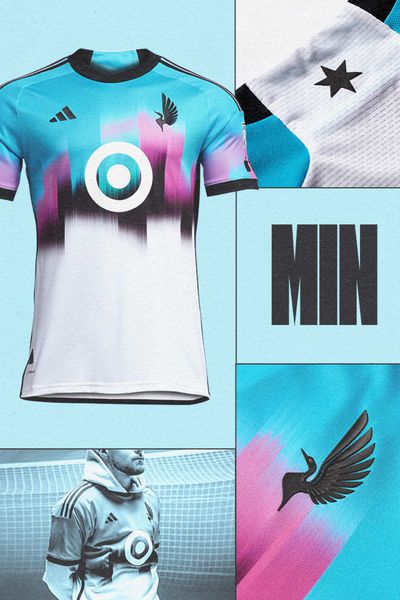
MINNESOTA UNITED : Northern Lights Kit (SECONDARY)
MLSSOCCER.COM
JPN (Jeffrey P. Nesker): This is tremendous. A grand-slam home run. Sure, there’s at least half a plain white, easy to stain and ruin forever part here, so stay away from those meatball subs, but we all know fashion=pain anyway, and it should cost you something to look this good. Seriously, more of this please. This is superb.
GRADE: A+
MH (Mark Hinkley): I love the colours and was worried the teases of the sky blue and pink were going to be sad tiny threads of colour on a dull kit, but the black smudges of a skyline look incredible. Wish it was sky blue on the back instead of white. If there’s a warm up jacket with this design, you got a winner there too.
GRADE: A-
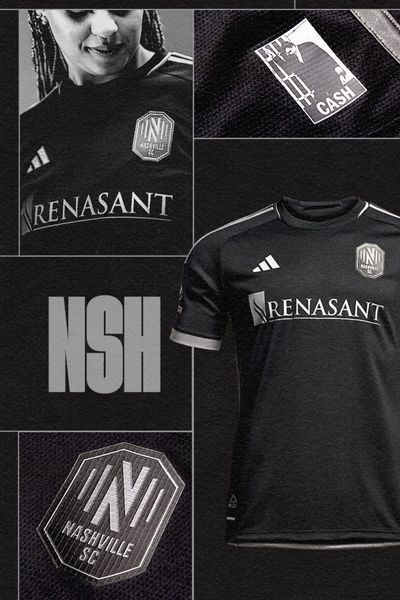
NASHVILLE SC : The Man In Black Kit (SECONDARY)
MLSSOCCER.COM
MH: With apologies to Johnny Cash, this is just black and silver, and while I suppose this is a tribute, I’m surprised that nothing else could be added to the kit to further reinforce the tribute to a musician. Are you paying for the silver or the black? There isn’t much on here that inspires or excites me. At least the silver is legible. It’s not terrible, but this is far from good.
GRADE: D+
JPN: I would shoot a man in Reno for this kit. I would do hard-ish time at Fulsome Prison for a voucher. I’ll … I’ll stop with the references. This is great. I love the monotone. Nicely done.
GRADE: A
NEW ENGLAND REVOLUTION : The Defiance Kit (SECONDARY)
NOTMLSSOCCER.COM
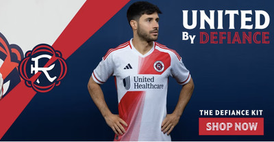
MH: OK so it’s a white kit, whatever. Let’s put the sash in the kit that’s on our new badge. Of course, sure. Let’s add this weird rotating sash that degrades with each new layer behind it. No. Why? Does it make it look interesting? I guess interesting can be annoying. It’s a perfectly fine kit without it but this design is clearly a subtraction-by-addition situation. For a better visual, just add a navy blue and white stripe border on either side of the solid stripe and it’s now improved.
GRADE: D
JPN: Grrr. Had to add this later BECAUSE MLS DOES NOT HAVE COMPANION ARTICLES FOR ALL THEIR CLUBS. It’s white. I hate it.
GRADE: F
NEW YORK RED BULLS : The Daniel Patrick Kit (SECONDARY)
MLSSOCCER.COM
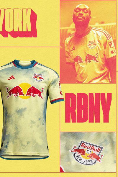
JPN: Apparently, Daniel Patrick is something of a hot NYC-based fashion designer, and, judging by this kit, he’s also a big fan of faux-marble detailing and maybe (?) the reason we’re seeing so much of it across the line this season. Regardless, it’s nice to see New Jersey cosplay as Manhattan, again. All kidding aside, this is a pretty great shirt that absolutely nails the intersection of streetwear and functional kit. Love the colourway, love the overall vibe.
GRADE : B+
MH: I understand that a design house came up with it, and the colours look great allowing their sponsor (and club owners) to pop off the chest. The watermark is an interesting effect to see within the chest of the kit, seeing it switch from the yellow cream to the blue grey as depending what it is overlapping. To be fair, probably would’ve rated it higher, but RSL did this kit much cleaner, but still excellent.
GRADE: A-
NYCFC : The Interboro Kit (SECONDARY)
MLSSOCCER.COM
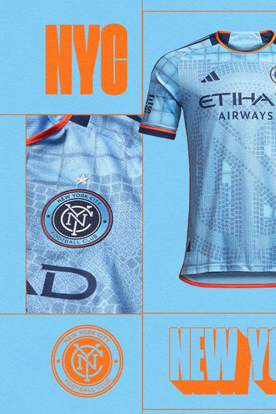
MH: I get it. It’s a tile mosaic that you might see in a subway. There’s so much iconography in New York, designers could be paralyzed where to draw inspiration from. That being said, I feel that there is a lot of action in this background, three different varieties of ‘tiles’, over-thought, possibly over-designed, where it looked better on paper than in action.
GRADE: C
JPN: So let me get this straight; NYRB want to be downtown, and NYCFC are desperate to escape, via train? Amazing. That is amazing. You know what else is amazing? This kit. Goodbye vague faux-marble, hello actual design cues! I hate that collar because it looks like an actual collar but is just V-shapes on a crew-neck and the less we say about “Dude Wipes” the better, but overall this is one of the best of the bunch.
GRADE: A
ORLANDO CITY SC : The Wall Kit (PRIMARY)
MLSSOCCER.COM
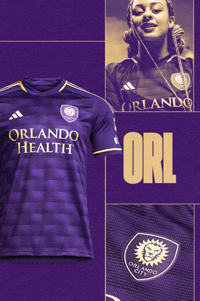
JPN: Is it purple? Check! Does it have vague brick-esque sublimated graphics? I think! Do I hate the collar? Yup. This is 50/50 good/bad for me. So a solid C.
GRADE: C
MH: Does Orlando have a brick making industry? Don’t know. Does this look good? It does. The pattern is incredible as from a distance it’s an obvious brick wall, but up close, you see the horizontal striping providing the 3D effect. While the reduction of their peanut butter brown trim is nice, it’s clear that the other elements are metallic, which is a great touch.
GRADE: B-
PHILADELPHIA UNION : For Philly Kit (SECONDARY)
MLSSOCCER.COM
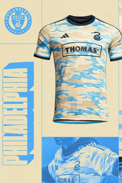
JPN: Serious question, shouldn’t this be the “For Thomas Kit”? because if you live anywhere near Philly and are named with any/all permutations of “Thomas”, you are now out $160US plus tax and shipping. I don’t make the rules. Also, kinda wish I had some kind of “Thomas” name because this kit is rad and I love it.
GRADE: A
MH: Digging the watercolor cloud pattern on the kit. It’s imaginative, different, refreshing and flat out nice. I appreciate that they took their navy and gold and pivoted to sky blue and sand as the base. Even with The Simpsons opening title sequence comparisons, that has to be a complement. Difficult to move forward from the previous offering of the lightning kit but they got another winner here.
GRADE: A
PORTLAND TIMBERS : The Portland Plaid Kit (PRIMARY)
MLSSOCCER.COM
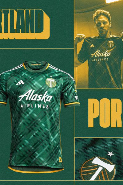
MH: This might be the perfect home kit for Portland. The plaid/tartan pattern is great, but rotating the pattern on a diagonal really highlights how dynamic it comes across. It’s busy without the distraction. From a distance it looks interesting. Up close it looks nice. Solid balance of the gold and white trim. I weirdly like the different green in the collar and on the back, when I shouldn’t. Wish the pattern could’ve made its way around the kit somehow.
GRADE: A+
JPN: Easy now, Rose City. We all know you are incapable of releasing a bad kit, but come on! Calling it the “Portland Plaid” kit is just so lazy and on-the-nose that I’m worried that you’re not even trying anymore, and when you are blessed with this colourway, you can afford to.
GRADE: A
REAL SALT LAKE : The Beehive State Kit (SECONDARY)
MLSSOCCER.COM
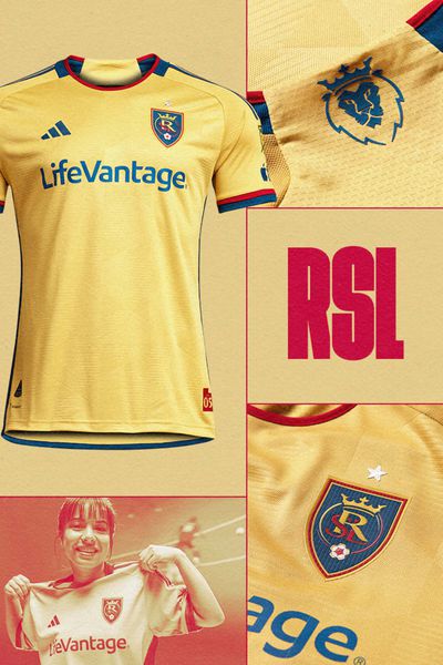
JPN: The only American club blessed by the Kingdom of Spain has got me here. I’m on a huge B-52’s kick, so anything “beehive” hits me right in the feels. Hate the collar, love everything else, but it’s still a plain shirt in an interesting colour, so points will be docked accordingly.
GRADE: C
MH: The colours blend perfectly and I appreciate that the pallet is a slightly varied take on their official gold/claret/navy combination. The hexagonal pattern with the horizontal stripes throughout the shirt adds some character and complexity to what would otherwise be a very simple kit. Great away kit.
GRADE: A
SAN JOSE EARTHQUAKES : The Active Fault Kit (PRIMARY)
MLSSOCCER.COM
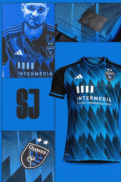
MH: I know I have low-key love for the San Jose home kits, and while I do not understand it, I have accepted it and this is no different. This feels like pattern-for-pattern-sake, but the gradient fading blocks in an overlapping pattern on the front is nice, similar to the angle and shapes in the badge. The white of the logos pop nicely here. This is one of those irrational likes.
GRADE: It’s probably a B-, but it’s an A- for me
JPN: I. Love. This. Especially the part where San Jose leans in to the inherent dangers of living on-top of a fault line right on the box. This is so great, like that Dudley Moore truth-in-advertising movie.
GRADE: B+
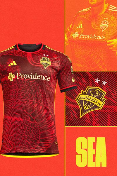
SEATTLE SOUNDERS : The Bruce Lee Kit (SECONDARY)
MLSSOCCER.COM
JPN: I was today-years-old when I found out, via an MLS club, that Bruce Lee had any connection with the city of Seattle. I’m glad I did and I’m glad this kit exists because it’s sublime. I’m not a huge fan of the Ed Hardy style all-over-print, but it works here. Don’t remember Seattle ever having a red kit, but who cares? Bruce Lee!
GRADE: A-
MH: So, culturally speaking, Seattle frightens me. While I didn’t love the Hendrix kit as much as everyone else, the Bruce Lee is absolute bonkers to me. I love the yellow dragon on the red kit, the scales on the sleeves, but the spiral scan-line-esque resembling an old TV is hitting me with some deep nostalgia. I would happily pay extra for the removal of sponsors. This is art.
GRADE: A+
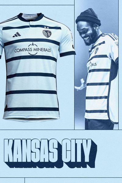
SPORTING KANSAS CITY : Hoops 4.0 Kit (PRIMARY)
MLSSOCCER.COM
MH: They got their hoops back, it’s still Sporting KC with their dulling colour scheme, but this is pretty decent. The spaced out stripes is nice, solid cuffs and collar, and I’m a sucker for a button (even if it is ONE button). I also appreciate the two stars sitting in the top navy stripe which would have otherwise been lost on the kit.
GRADE: B
JPN: How about an “Argyle Socks 2.0 Kit” instead? No? Ok, then, well this is pretty great in the meantime. Classic, spiffy, no weird collars, clean. I dig it.
GRADE: B+
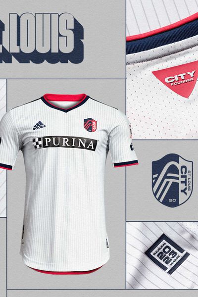
St. Louis CITY SC : The Spirit Kit (PRIMARY)
MLSSOCCER.COM
JPN: I already low-key hate this Club. I mean, just look at how they want their name typed out, with the lowercase and ALL-CAPS “CITY SC” just looking so incorrect and uggers up there. And then, to add insult to injury; this horrible thing. So the one club with literally YEARS to think on their debut stripe comes up with this? HOW??? I could design this in 20 seconds, and even i wouldn’t be mean enough to put a dog food company as shirt sponsor on this dog s**t. Atrocious.
GRADE: F
MH: I am very much here for this pallet. Cerezo Osaka, MLS-style (sorta, close enough). This colour combination should be glorious year to year, and this first offering is very nice. The half flat and half pattern cherry pink with the navy and yellow cuffs and collar, and yellow trim at the bottom on the back, frames the whole kit. This is an excellent debut kit.
GRADE: A
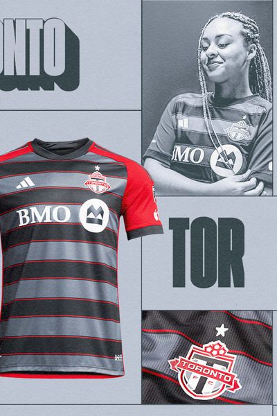
TORONTO FC : The Club Kit (PRIMARY)
MLSSOCCER.COM
MH: It feels strange to critique a project (and it was a whole 2 year process) I was attached to. Still thrilled to have been a part of it, but I had a suspicion my partner here would enjoy this.
GRADE: no comment
JPN: Glad I’m going second on this one because obvious, and you’re going to get the full story here when Mark and I discuss it in detail on the Podcast/Livecast companion. But alas, I really don’t get the hate here – Ok, I DID see the early leak of the youth replica “version” of this that had all of TFC-Land in stitches, but this is decidedly not that. This is pretty dope, and it’s onyx. That’s “amps go to 11” territory for me and I’m not even getting to the “I’ve heard the bloke who had a hand in designing it is a pretty cool dude” part, or the “inverse of the 2017 Primary” part, which is my exact favourite flavour of hipster easter egg. I really like it, and I’m not just saying it because Mark’s here.
GRADE: A
VANCOUVER WHITECAPS : The Bloodlines Kit (PRIMARY)
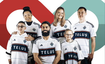
NOTMLSSOCCER.COM
JPN: Dare to be different, I guess. The Whitecaps are too cool to be on the MLS new kits list, and too lazy to do a webpage in the style of every other club, save Montreal, lol, who don’t get a new kit because Montreal, I guess. So forgive this screen cap of happy Whitecaps fans in lieu of the whiz-bang unified graphics direct from MLS HQ featured everywhere else. I’m mad at you, Whitecaps, but this kit is pretty classy. Love the new shirt sponsor.
GRADE: B-
MH: Whitecaps home kits feel like you have to make a concerted effort to botch. Even when it’s plain, it’s still unique and still theirs. The big navy hoop with the red stripes at the top and bottom is a nice frame (too bad it’s wasted on a sponsor) look great but I’m meh about the thin light blue horizontal pinstripes. They’re so far apart that I’m not sure if they’re helpful other than filling in a nice white kit. I like that the collar and cuffs are also white, as it’s fairly easy to just lean into another colour. Maybe the sky blue? Nah, this is fine. Still love use of blue name and red numbers for the back.
GRADE: B+
Phew, there’s the last 14 kits of our round-up.
This year’s crop is pretty brilliant. Aside from a few sad leftovers of the “White shirt, ho cares?” era in MLS kit history, the lion’s share are bold, colourful, and inspired. There are a few solid contenders for all-timers in here. This is a good thing.
What do you think of our reviews? Agree? The other one? Let us know in the comments, and again, keep your eyes/ears/kit/jersey peeled for a special episode of Toronto ‘til I Die wherein Mark and I discuss our ratings.